Instagram has evolved significantly over the years, implementing various features and updates to enhance user experience. Yet, an iconic square grid layout has always remained a hallmark of the platform. With the update expected to start this month, good old design is now undergoing a transformation.
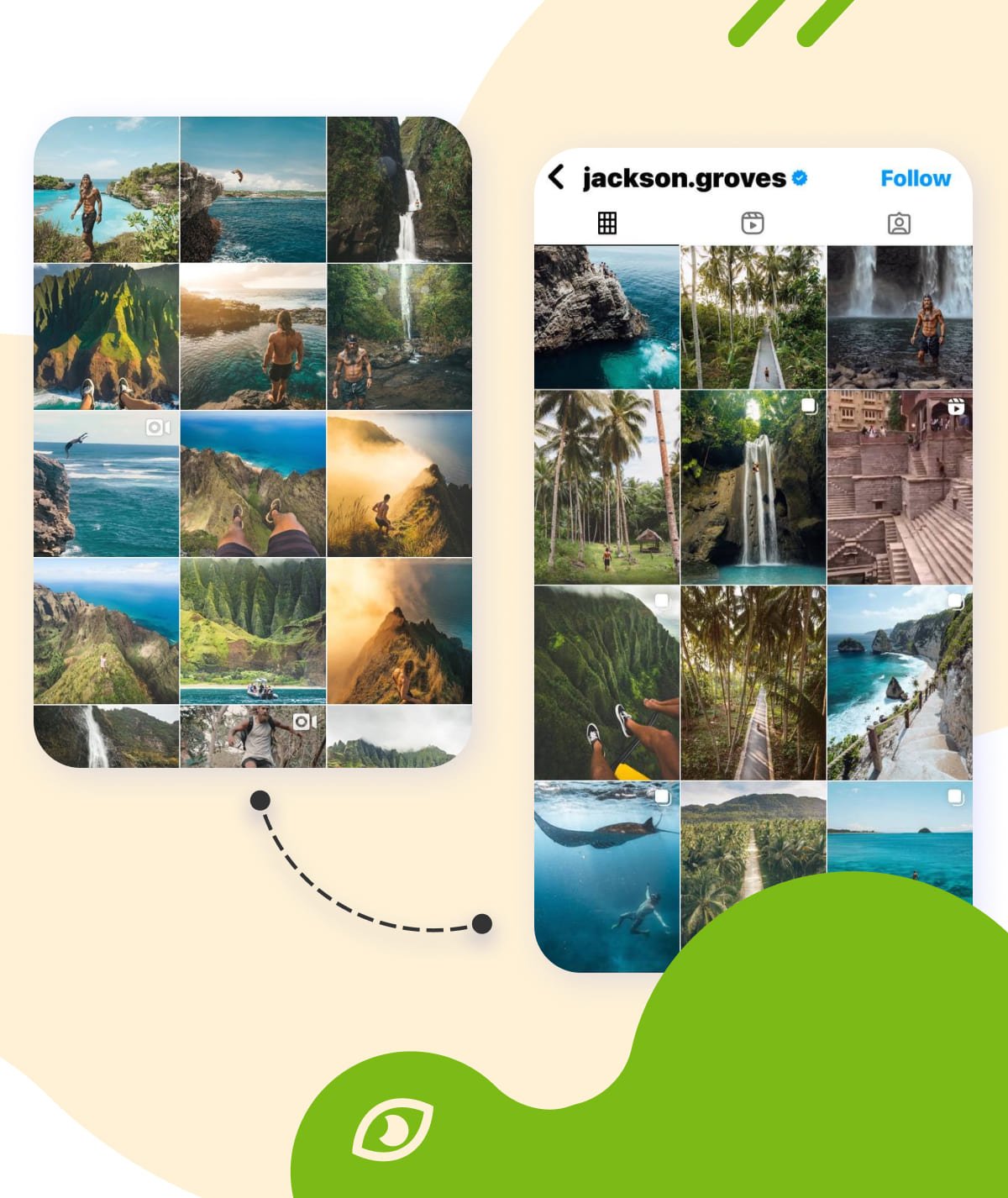
Meta is rolling out new vertical-shaped grids. Those with the latest version of the app will soon see traditional square tiles being replaced by elongated rectangles. A different visual content presentation not only changes the aesthetic of user profiles but may also impact the entire social media landscape.
The Roots of the Rectangular Revolution
In light of the potential TikTok ban in the US, Instagram is proactively taking steps to support content creators who may need a new “home”. By extending the length of Reels and preparing to launch a new video editing app, Instagram aims to provide valuable tools and opportunities for creators, positioning itself as a strong alternative.
And now the developers have reached the holy of holies! Instagram head Adam Mosseri talked about this change in his Story, “I know some of you really like your squares. And square photos are sort of the heritage of Instagram. But at this point, most of what’s uploaded, both photos and videos, are vertical in their orientation,” adding that it is a “bummer to overly crop” your photos to fit into the square grid.
See the Advantages a Vertical Grid Layout Offers
The vertical grid can be a game changer because it allows you to do some truly amazing things from a design perspective. It’s perfect for both brands looking to create better connections with their audiences through more refined visual components and for everyday users who get more space to flex their creative muscles. At least, users get:
Mobile optimization: Many Instagram users access the platform on their mobile devices. The update would create a visually appealing and easy scrolling experience in portrait mode, matching how people naturally move their thumbs. It would help users who often browse multiple profiles, making it easier to navigate and interact with different content.
Enhanced visual experience: This design choice provides individual posts with ample space to make a strong impression, allowing them to stand out to viewers. It is particularly advantageous for showcasing visually rich content, such as vibrant high-resolution photographs or engaging dynamic videos, which can often be lost in more cramped layouts. In addition, viewers can easily focus on each post without distractions, leading to more immersive interactions. The result is a more captivating engagement, where the audience can appreciate the details and artistry of each post.
Improved promotion strategies: The vertical layout presents an exciting opportunity for businesses. This format is a good fit to craft cohesive narratives that flow seamlessly across multiple posts, allowing for a more engaging storytelling. This way, customized grids can significantly enhance brand identity and resonate more deeply with their audience, which is a key element for leveraging a distinctive and memorable online presence.
With such a bright perspective, there is a mixture of opinions and reactions about the update.
Mixed Feedback and Reactions From the IG Community
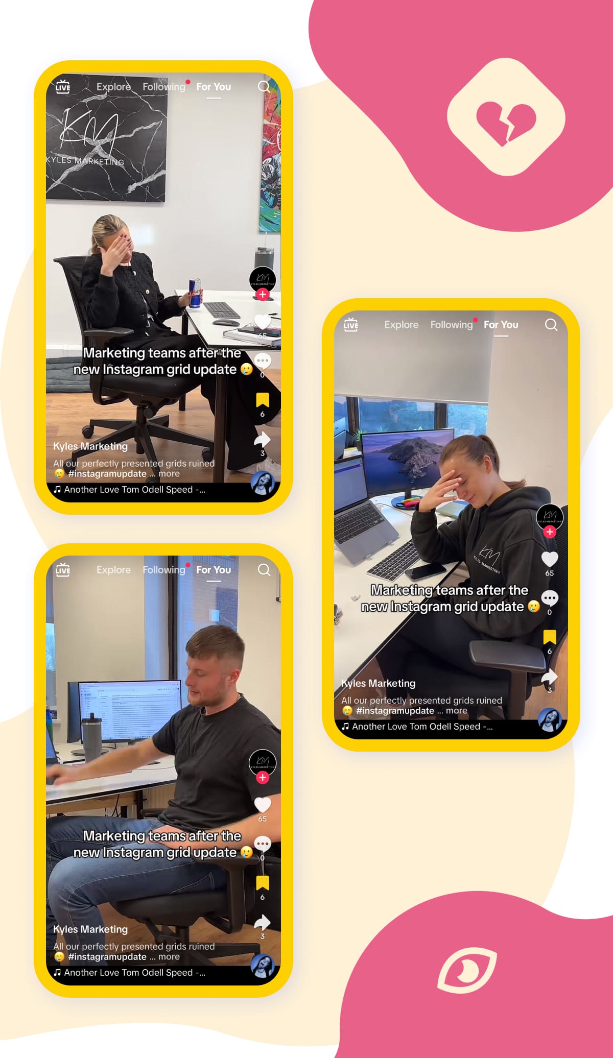
Some long-time users and influencers express skepticism regarding the proposed change. For years, they have intentionally employed the classic 3×3 layout for a balanced and organized aesthetic, making it easier for followers to engage with their content. However, the shift to a vertical type could disrupt this carefully curated strategy. Adapting to a new format might not only complicate their visual storytelling but also require significant adjustments to their overall content approach.
I understand that negative feedback means nothing to you at this point, but the change to the grid is emotionally painful. You’ve mangled and destroyed a primary artifact of my youth, something I spent so much of my creative energy making. Eat my soul for a dollar I guess! Ryan (@rrrrrrrrryan)
Business owners and brands on one hand see the potential benefits of this format, including enhanced engagement and a more streamlined viewing. On the other hand, there are significant concerns among others regarding the implications of this shift. Many feel that their current SMM-tactics for traditional horizontal formats may have been effective which requires substantial marketing rethinking.
You say you are focused on creativity but you just completely destroyed years and years of artists and designers curating their feeds into squares. It’s such a thoughtless decision, give us an option!! (@the.creativityproject)
For any user on the platform, losing a polished and consistent photo sequence feels like a nightmare, especially if it's your job.
Hold on! Not everything is irretrievable, so don’t worry—there is hope yet!
Adapt You Profile Aesthetics to a Rectangular Photo Shape
Even though Instagram has changed the way users’ profile grid looks, you can still fix your dear old Reels a bit. The method works for most of the covers, especially those containing text, logos or being a part of a collage.
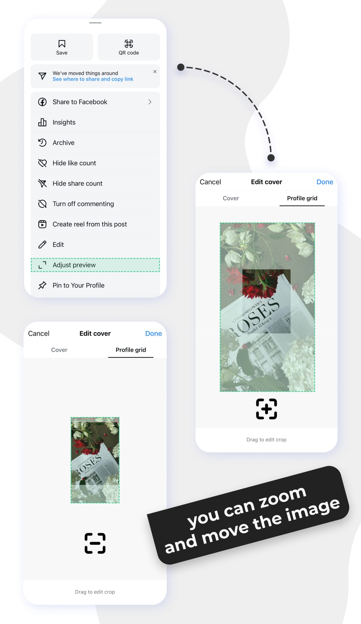
Just tap on the three dots for options and scroll down to "Adjust Preview." It’s a handy little feature that can help restore your grid to how you like it!
You can drag and drop your photo around, zoom in and stuff to have a clean feed again. In most cases pulling down the image version will be enough.
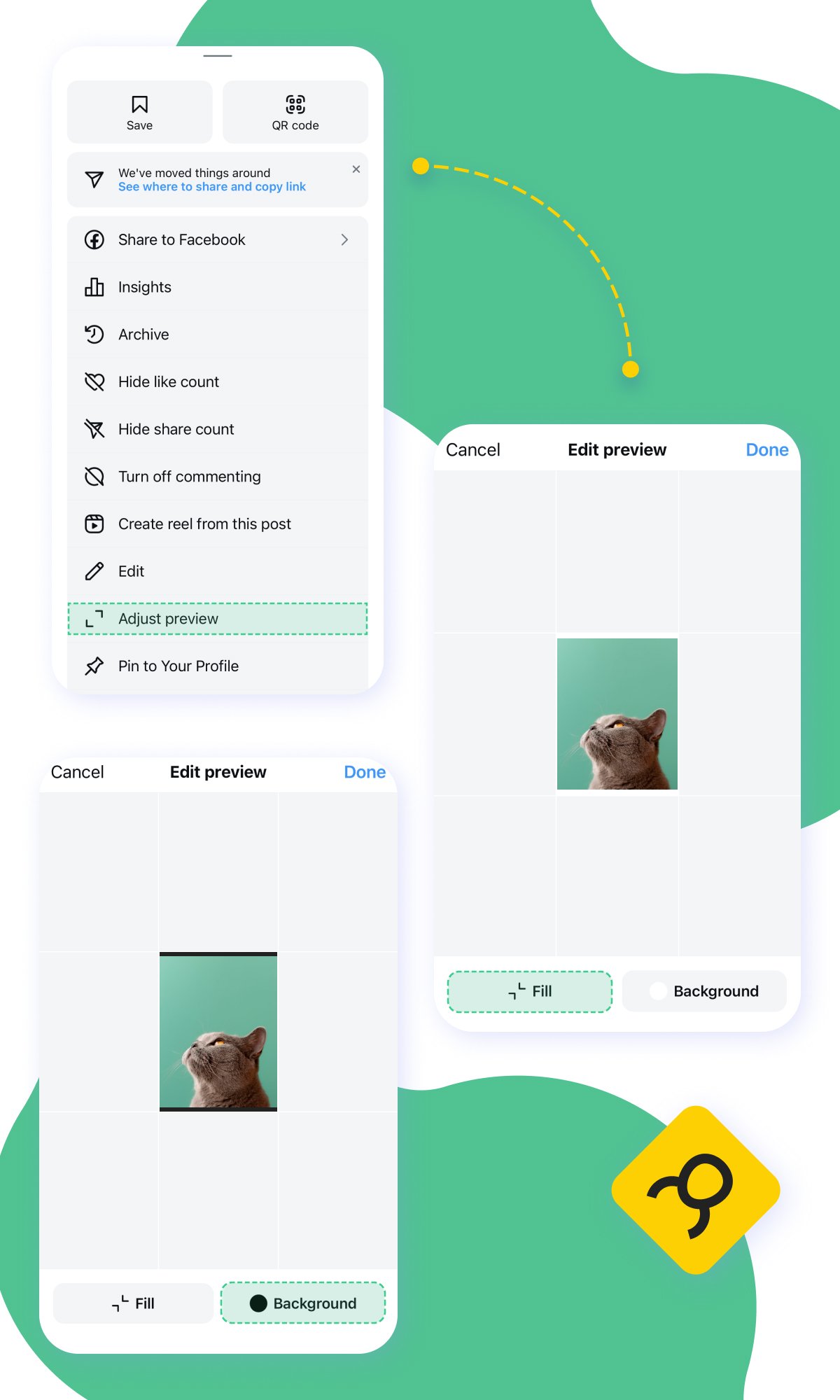
Things are not so positive with regular posts. Still, there is something that can be improved about them as well. Again, even small tweaks can create a more pleasing and professional look.
Go to the same ““Adjust Preview” feature. Click “Fit” or change the background to black or white. Not much, but in any case it will look more aesthetically pleasing.
For future uploads take a moment to review these recommendations to ensure a smooth process:
The supported image size for Reels is 1080×1920 pixels (9:16). Keep in mind that when displayed on your profile, the video is cropped to 1080×1440 pixels (3:4). So, it’s advisable to avoid placing text in the upper and lower parts of the screen, as it may be obscured by interface elements.
For Stories, the dimensions should also be 1080×1920 pixels (9:16). To ensure visibility, all key elements should be placed within a safe zone of 1080×1610 pixels. It’s best not to put crucial information in the upper and lower sections (approximately 155 pixels) as they could be lost.
When it comes to Posts and Carousels, the optimal size is 1080×1350 pixels (4:5). Instagram automatically crops images to 1012×1350 pixels (3:4) when displayed on your profile, showing only the central area. You can upload square images, yet they will be adjusted to a 3:4 aspect ratio.
And this is just the beginning of a big overhaul…
Say Goodbye to Conventional Highlight Bubbles
Many of us are accustomed to easily accessing Highlights, which are currently positioned above our posts on Instagram. However, a significant change is on the horizon! Instagram is planning to relocate them to a dedicated section within your profile tabs, moving media away from its current placement above your profile grid.
This shift raises some questions about the organization of the Highlights. Users may wonder whether the highlights will be sorted based on the date of their creation or their most recent updates.
All of your Highlights will have separate, vertically aligned thumbnail images for each topic. Good news: Instagram will allow reordering. This long-awaited feature gives Instagram enthusiasts greater control over how they showcase their content, making it easier to curate profiles in a way that best reflects the author’s narrative.
Instagram chief Adam Mosseri recently explained the change, and what they’re trying to do be reforming Stories Highlights on profiles:
Highlights are a great way to showcase your favorite stories, but they are visually complicated and push your grid down. In order to maintain creator control we’re building a tool so you can re-order your entire grid and make it whatever you want.
There's no telling what will happen to your current IG account. So if you want to keep things as they are, it's time to use the Inflact’s tracking profile feature and protect yourself from the unexpected.
Welcome to our YouTube channel to learn about Inflact's amazing tools for Highlights and more.
To Sum It Up
Embracing the new vertical grid format may take some patience, but it holds the promise of transforming user interactions and inspiring brands to refine their content strategies. This shift will enhance the emotional connections we forge in the digital realm.
Though the outcome of this bold experiment remains to be seen, one truth stands strong: the evolution of vertical profile grids is just one inspiring chapter in the remarkable history of social media's future.
