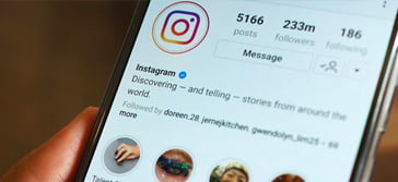
Instagram grids that inspire people to tap on Follow: trends and anti-trends
Your products may be high-quality and unique, but people will not be willing to order and try them if they don't like your Instagram feed. To enhance your online sales in such a visually oriented platform as Instagram, it’s essential to think over aesthetics and take care of your visuals’ quality.
Let’s analyze – how long does it take for you to understand if an account is worth following? What makes you want to see updates in your feed regularly? Which elements catch your eye and which push you away?
Even though you apprehend the importance of grid layout, these 3 benefits will encourage you to put more effort into your Instagram aesthetics:
- Organic followers and clients. Usually, it takes only around 5 seconds for users to decide whether they like your feed or not. If Instagrammers find it attractive, they will immediately start following. Therefore, a stylish feed boosts subscribers without sinking a lot of money into ads.
- Highlight brand identity. The design of the grid emphasizes the uniqueness of your company and products. Instagram is a platform where users learn about each other through visuals. You can prepare a long-read post, but one picture might deliver information to the target audience more effectively and faster. If a user or a potential client is not attracted by the visual, they won’t spend the time reading your captions. Therefore, if you run a business account, a branded grid layout will help to express the values of your brand and encourage your audience to check the texts – even the first stray users to find your account.
- Earn more thanks to an aesthetic feed. A catchy grid is capable of increasing the value of your goods compared to competitors – this means that you can sell similar goods at higher prices. The issue is that even the same product can look either expensive or cheap depending on how it is presented in the feed.
All in all, Instagram is rapidly shifting. Therefore, it is crucial to update the visual ideas and the principles of running your account, since trends determine how much you will be in demand. If you need to dive deeper into IG aesthetics, explore our comprehensive guide Create Visually Aesthetic Instagram.
3 grid layouts you should leave in the past
First of all, let’s review grid examples that are out of fashion. No top-ranked or bestselling Instagram-based shop will apply these ideas. So if you are still considering any of these for your grid, stop immediately. In the second section of this article I’ll show exciting examples you can apply boldly.
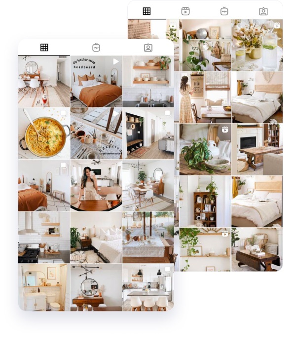
- Columns too systematized
Breaking up the grid with squares that create a central image is considered out of Insta fashion. Especially if it’s a digital illustration.
When Instagramers first open your account and see that you arrange all the content into columns or by a certain pattern, and you are using all the same colors, they will obviously get bored. Imagine if you constantly come across the same visuals published by a certain business account – wouldn’t you get tired of it in a week or two? Therefore, leave the systemization and logic for data analysts – Instagrammers desire wildness and creativity.
- Templates
Templates might look aesthetic, but most of the time they also look dull and unnatural. And authenticity and diversity are what Instagrammers want today.
The main fashion trend is getting back to nature, and Instagram is highly influenced by general fashion trends (because most influencers are global trendsetters). That’s why arranging your feed via templates will go against the trend and Instagrammers’ expectations.
So, stop downloading paid or free templates for your grid layout – with these your account might lose its uniqueness. Many other people can apply the same template. When an IG user sees that a feed is based on a template, this means you are like everyone else, so they won’t find reasons to get interested in your content.
- Monochrome
It used to be popular, but Instagrammers are tired of it. When the gallery looks like a matching set, there’s just one thought: conventional and boring. But we are here to attract – so skip the hours of editing.
Do you agree that it is much more difficult to combine a balance of colors than choosing one shade for all posts? That’s why monochrome is no longer considered a creative solution for an Instagram feed. Instagram should impress and surprise – be bright, be unexpected, use bold color combinations. Be brave and open to experiments.
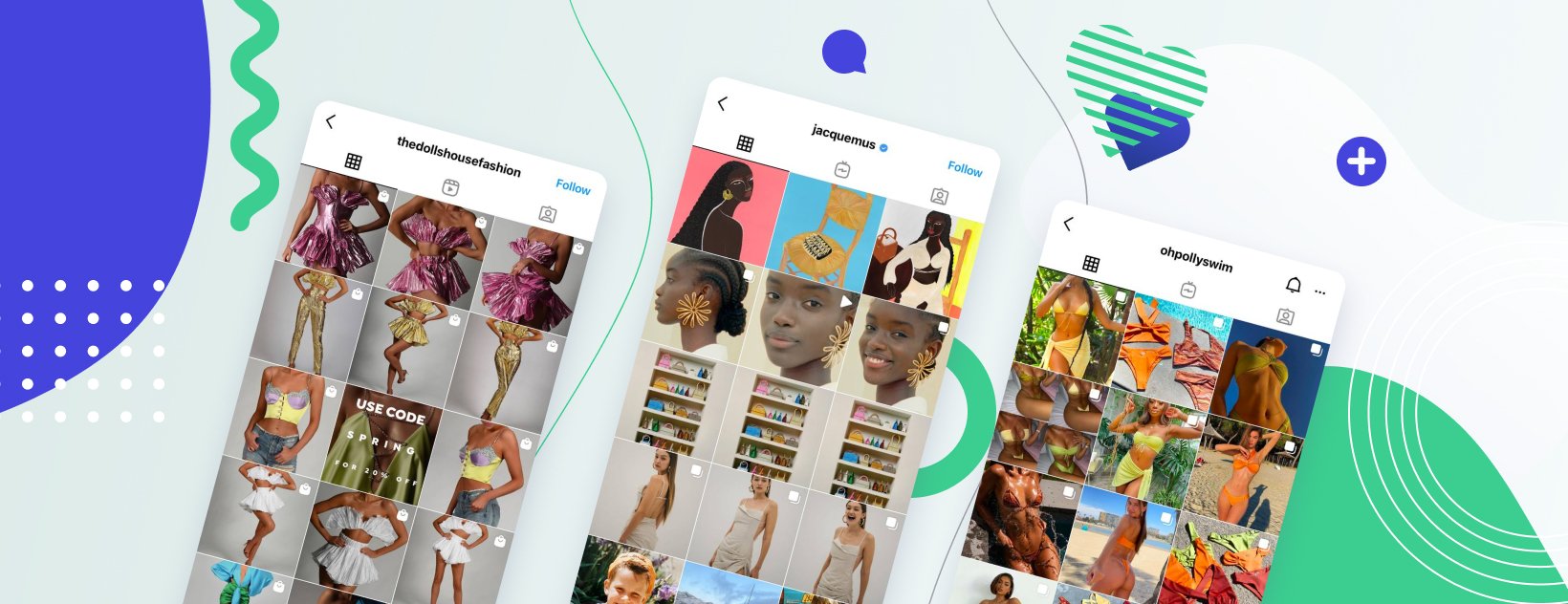
Instagram grid trends: get out of shadow
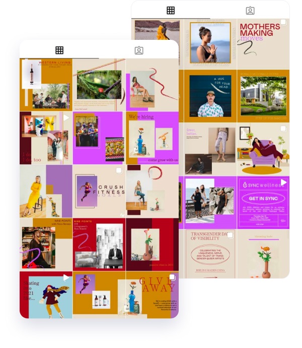
#1 DIVERSITY AND FREEDOM
The main rule to design your grid layout is variety and experimentation. The more compositions, people, colors, and post types you use, the better. They should be different but aligned to your brand identity.
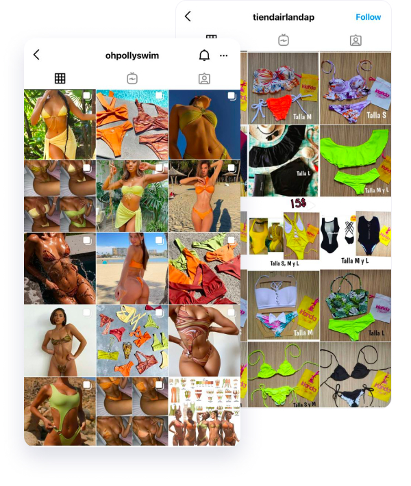
#2 CREATIVE COLOR-CODING OF POSTS BY ROWS: THE RAINBOW EFFECT
This idea was spotted in a myriad of big accounts. They pick a certain color for several rows of the grid and collect images according to this theme. With this effect, the feed does not look dull because you can use any compositions, mix people, your products, memes and downloaded images. At the same time, it’s sorted logically by colors that will help Insta users apprehend the palette of your brand at a glance.
#3 DESIGN ROW BY ROW
The trick for this one is that you have to post three images at a time, or the alignment will be off. Experiment with panoramic images for one of your rows. This layout is popular among designers, photographers, architects – those who aim to showcase details.
We recommend mixing such panoramic rows with random ones for a more natural and diverse look.
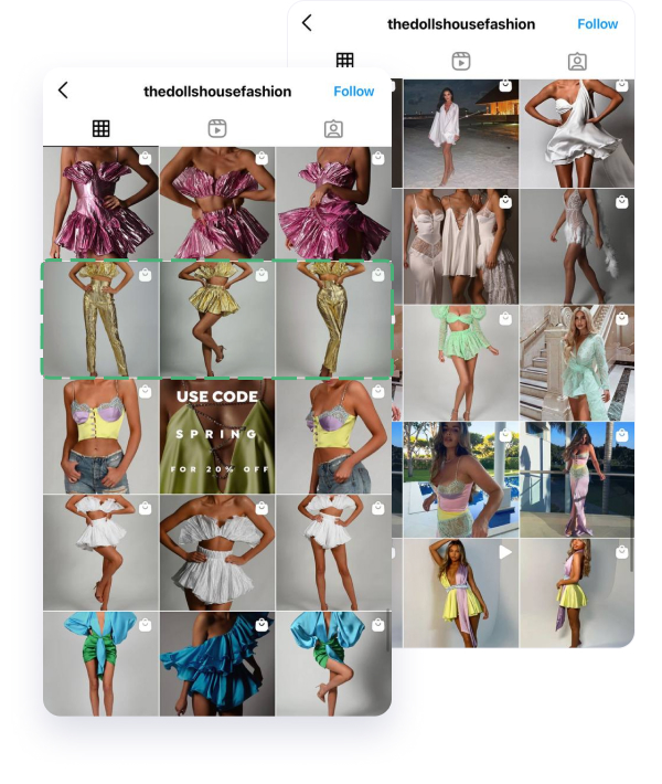
#4 DESIGN ROWS BY AN IDEA
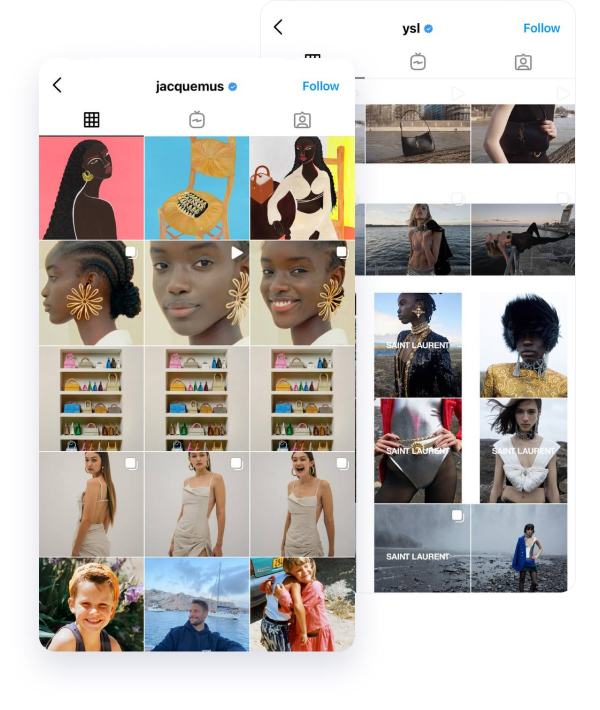
Like luxe fashion brands YSL and Jacquemus, you can unite images by their concept. For example, three images from your childhood in a row, 3 photos from one photoshoot. Or use a bold idea – post 3 similar photos in a row to grab attention (but they should be balanced with variety across other rows).
#5 MIX VIDEOS, IMAGES, CAROUSEL POSTS
Experiment not just with colors and images but also with post types. When a new user first sees the account, they will apprehend that you use various types of content – not sticking just to photos.
Finally, the grid gives you a birds-eye view of a user’s posting history. When you visualize how the whole desirable grid should finally look, it’ll be simpler to systemize the mood board. You will think about images in the concept of a “grid” – that’s a key to Insta visual success (remember it takes just five seconds for viewers to “read” the visuals).
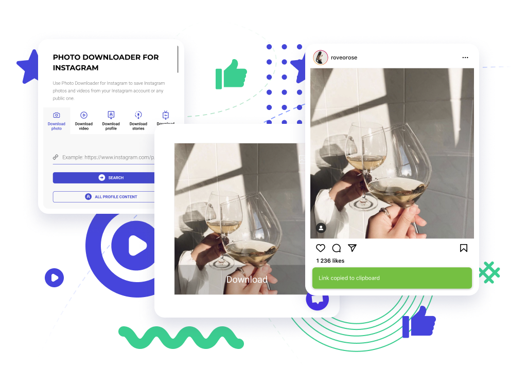
Tools like Inflact Posing allow you to preview the final grid look before publishing. Also, you can preview it in the gallery of your phone by adding visuals for Instagram to a separate album.
Related Articles

Significant benefits


